
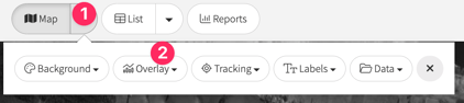
You can enable the map overlays by clicking on 1. the Map dropdown button and then clicking on 2. the Overlay button.
The map overlays provide visual information, enabling you to assess the following quickly.
- Plain - Shows the farm map in its simplest form with each paddock coloured the Pasture.io Green Colour.
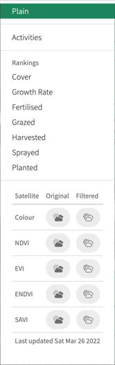
Rankings
- Cover - Shows the average pasture cover of each paddock segmented by colour.
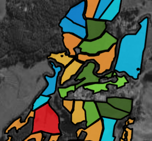
- Blue = above the pre-grazing cover
- Green = between the farm average and pre-grazing cover
- Yellow = between the post-grazing and farm average cover
- Red = under the post-grazing cover
- Cover shades
- Red doesn't change in shade
- A darker orange signals a lower cover of the range and conversely, a lighter orange signals a higher cover of the range.
-
- A lighter green, and blue signals a lower cover of the range and conversely, a darker green and blue signals a higher cover of the range.
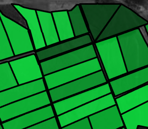
- Growth Rate - This shows each paddock's average pasture growth rate on a green spectrum.
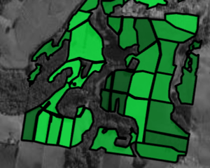
- Darker green = higher growth rate
- Lighter green = lower growth rate
- Fertilised - This shows when fertiliser was last applied to the paddock.
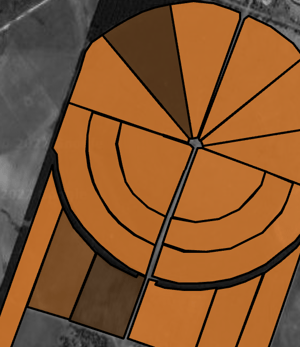
- Darker brown = longer period since fertiliser applied.
- Lighter brown = shorter period since fertiliser applied.
- Grazed - This shows the time since the paddock was last grazed.
- Darker green = more extended period since grazing.
- Lighter green = shorter period since grazing.
- Harvested - This shows the length of time since the paddock was last harvested.
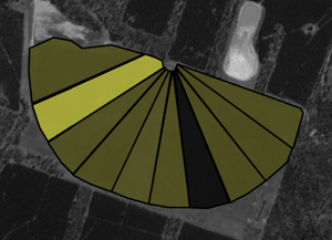
- Darker yellow = more extended period since a harvest.
- Lighter yellow = shorter period since a harvest.
- Sprayed - This shows when spray was last applied to the paddock.
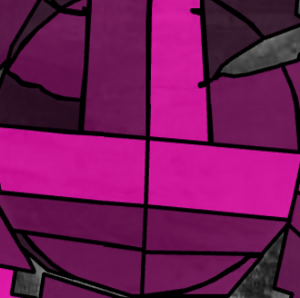
- Darker purple = more extended period since spray applied.
- Lighter purple = shorter period since spray applied.
- Planted - This shows the time since the paddock was last planted.
- Darker blue = more extended period since the paddock was planted.
- Lighter blue = shorter period since the paddock was planted.
Satellite Images
The satellite image overlays that you can view are:
- Colour
- NDVI
- EVI
- eNDVI
- SAVI
You can read about the satellite indices here.
Also, you can view the satellite images in the following ways:
- Original - shows the original unfiltered image. For example, you can see if there is a cloud in these images.
- Filtered - shows the images as filtered for things such as cloud or cloud shadow, etc. For example, you can see the parts of the image sent into the machine to process pasture readings.